








Professional UX deliverables produced end-to-end
IOS MOBILE APP
USER RESEARCH
INTERACTION DESIGN
END-TO-END UX
My role
Duration
March-April 2026
Tools
Figma
Platform
iOS App

Meal planning and grocery shopping are completely disconnected experiences
People plan meals in one app, build grocery lists in another, and track their pantry on paper or not at all. The result is duplicate buying, food waste, and repeated store trips that could have been avoided with a single unified flow.
HarvestBasket was designed to connect all three into one seamless iOS experience, tailored to four very different user types with distinct shopping habits, household sizes, and priorities.
4
Distinct user archetypes served by a single app
5
Core user flows across the full app
46
Screens mapped before wireframing began
How people actually shop and plan
Research began with user interviews and competitive analysis to map existing grocery and meal planning behaviors. Information was synthesized and key insights with themes were discovered.
Users juggled between 2–4 separate apps or methods; notes apps, supermarket sites, and recipe platforms with no connection between them.
Every persona experienced food waste, but for different reasons; impulse buys, forgotten pantry items, or over-buying due to poor planning.
Urban users shop frequently in small batches; rural users buy in bulk once a week. The app needed to serve both models without compromise.
— Interview participant, foundational research
Understanding the user before touching the design
Research began with four detailed personas; Laila, Maria, Omar, and Colin. Journey maps across 6 stages revealed friction points and drop-off moments. 12 themes and 5 opportunity areas were identified across all personas.
The personas that guided every design decision throughout the project. From information architecture, component hierarchy to interaction designs were based primarely on the users.
"I always end up buying things I already have at home then something expires before I use it. I need the app to tell me what to cook with what I've got."
— Composite insight from persona research
From research to architecture
The core challenge was building a navigation model that felt natural for both Laila's quick daily check-ins and Colin's weekly bulk planning sessions. The sitemap was structured to keep the most-used flows. Grocery list, meal plan, pantry is always one tap away.
Navigation built around five primary tabs: Home, Meal Plan, Grocery List, Pantry, and Profile. The recipe search and pantry scanner being integrated closely.
Full flow diagrams with decision points, branches, and cross flow connections for all 5 flows.
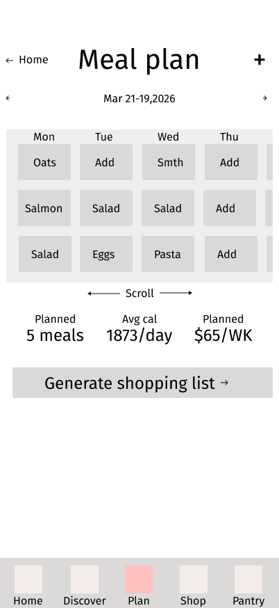
Meal planning front and center on the home screen, pantry tracker accessible from the grocery list, and a one-tap "add to list" from any recipe card.
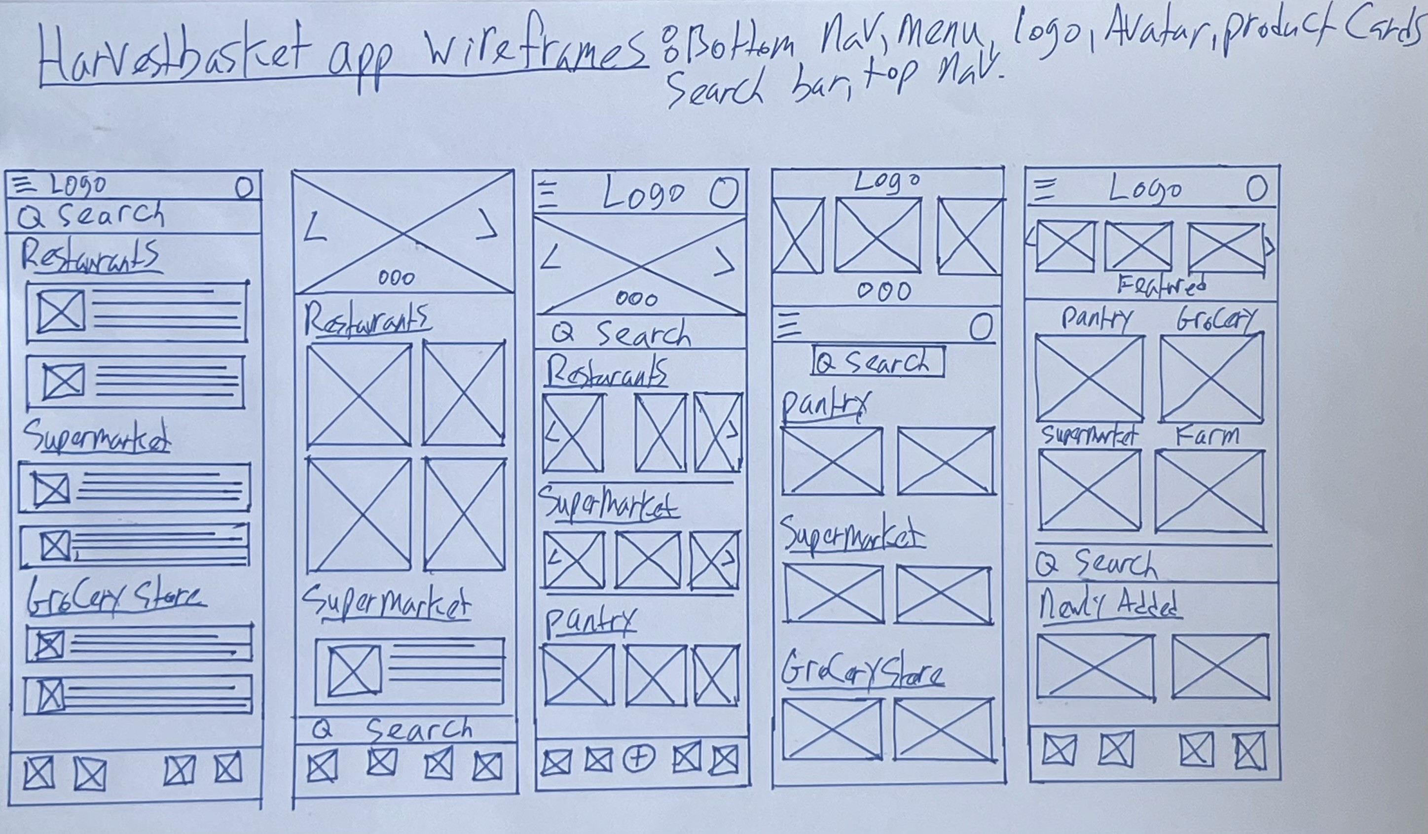
Two rounds of usability testing: lo-fi & hi-fi
Two rounds of unmoderated remote usability testing were conducted. Lo-fi wireframes with 9 participants, then the hi-fi prototype with 10 participants. Both sessions covered 6–7 task prompts across onboarding, meal planning, recipe discovery, delivery ordering, and pantry management.
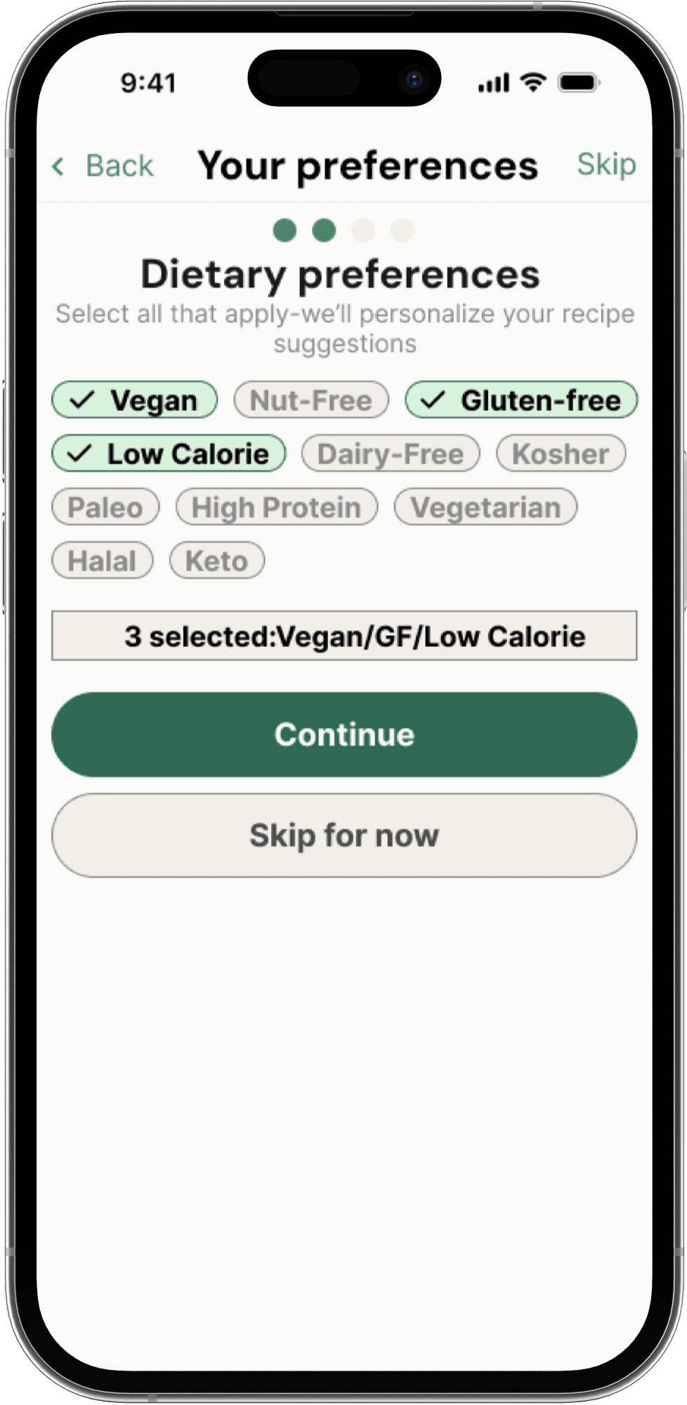
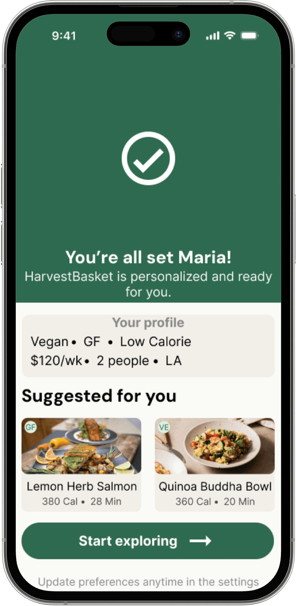
The budget input was unclear, users couldn't tell if it was a slider or a text field. The "you're all set" screen showed a name that was never collected during setup, and users expected a screen to enter their name, email, and password.
Users instinctively tapped Tuesday on the home screen but nothing happened. They had to find "plan meals week ahead" in quick actions first. After adding a meal, the add button remained visible, making it unclear if the action was successful.
Multiple participants couldn't progress through the recipe cooking steps because the "next step" button was non-functional in the prototype, preventing full evaluation of the cooking experience.
Delivery windows were displayed but couldn't be tapped. Users could see the time options but were unable to select one, making the ordering flow feel incomplete.
After finding expiring items and selecting a recipe, users were required to regenerate a full shopping list with no back button available. Several participants found this flow confusing and overly long.
The shop button in the navigation bar was described as unclear by participants. The "cook now" button was also flagged as too small and not prominent enough relative to surrounding elements.
Participants found the expiring items alert and the "find recipes for all items" feature intuitive and genuinely useful, directly addressing the food waste problem the app was built to solve.
Most participants described the app as easy to navigate. They praised the recipe discovery flow, delivery ordering steps, and the step-by-step cooking instructions with built-in timers.
An unmoderated remote usability study was conducted on the hi-fi prototype with 10 participants across 7 task prompts covering onboarding, meal planning, recipe discovery, delivery ordering, and pantry management.
Multiple participants couldn't distinguish between their remaining budget and total spent. The two figures displayed side by side caused consistent confusion at checkout.
Several users struggled to read the "tap to see", "use it up recipes" text. It was described as too grey and difficult to spot. The orange alert rectangle text also lacked sufficient contrast.
Users felt stuck on certain screens with no clear way to go back. The meal plan section only had one back button, and some screens had no exit path at all.
The "you're all set" screen after onboarding confused users, and items on screen appeared selectable but weren't. Users expected to be taken directly to the home screen.
Users questioned why a timer appeared on steps that didn't require one. It was unclear whether it tracked cooking time, oven time, or personal elapsed time.
The bottom nav bar was overshadowed by larger text above and went unnoticed initially. Multiple participants noted it was too small to be recognised as a primary navigation element.
Several participants specifically called out the automatic pantry update on delivery as a standout feature. Exactly the food waste reduction behavior the app was designed around.
Design System
A full brand identity and design system was built -forest green primary palette, cream and stone surfaces, DM Sans + Inter typography, complete component library. All 6 High priority usability fixes resolved before visual polish was applied.

Tap through the full iOS app - home, meal plan, grocery list & pantry
View Prototype
Colour tokens, type scale, component library
All 5 flows at iPhone 14 Pro resolution
145 connections wired across all screens
Lo-fi with 9 participants, hi-fi with 10 participants
What was delivered
A fully tested hi-fi interactive prototype built across 10 structured deliverables and validated with 19 participants.
Usability study participants across 2 rounds
Usability issues identified and resolved
What I'd do differently
Starting usability testing at the paper stage would have caught the onboarding confusion and broken cook flow much earlier. This would have saved time and prevented late-stage redesigns.
Key takeaway
Designing for four different personas forces you to build systems, not screens. Every decision had to work for all four users while making the design stronger and more inclusive.